Decluttering ordination plots in vegan part 1: ordilabel()
In an earlier post I showed how to customise ordination diagrams produced by our vegan package for R through use of colours and plotting symbols. In a series of short posts I want to cover some of the options available in vegan that can be used to help in producing better, clearer, less cluttered ordination diagrams. First up we have ordilabel().
One of the problems that ordination results pose is that there is a lot is a lot information that we want to convey using a relatively small number of pixels. What we often end up with is a jumbled mess and because of the way the sample or species scores are plotted, the important observations could very well end up covered in all the rare species or odd samples just by virtue of their ordering in the data set.
The simplest tool that vegan provides to help in this regard is ordilabel(); it won’t produce a publication-ready, uncluttered ordination diagram but it will help you focuson the “important”1 things.
ordilabel() draws sample or species scores with their label (site ID or species name/code) taken from the dimnames of the data used to fit the ordination. To help their display, however, ordilabel() draws the labels in a box with an opaque background so that the labels plotted later (i.e. above) cover earlier labels whilst remain visible because of the opaque background. ordilabel() also allows you to specify the importance of the samples or species via the priority argument, which in effect controls which labels get drawn first or beneath all the others.
Here I’ll use a PCA of the famous Dune Meadow data2. First, we load vegan and the data and perform the ordination
require(vegan)
data(dune)
ord <- rda(dune) # PCA of Dune data
In this example, I want to give plotting priority to those species or samples that are most abundant or most diverse, respectively. For this I will use Hill’s N2 for both the species and the samples, both of which can be computed via the diversity() function
## species priority; which species drawn last, i.e. on top
priSpp <- diversity(dune, index = "invsimpson", MARGIN = 2)
## sample priority
priSite <- diversity(dune, index = "invsimpson", MARGIN = 1)
The MARGIN argument refers to which dimension or margin of the data is used; 1 means rows, 2 means columns. Hill’s N2 is equal to the inverse (or reciprocal) of the Simpson diversity measure.
Throughout I’m going to use symmetric scaling of the two sets of scores for use in the biplot. As it is important to make sure the same scaling is used at each stage it is handy to store the scaling in an object and then refer to that object throughout. That way you can easily change the scaling used by altering the value in the object. Here I use scl and symmetric scaling is indicated by the number 3
## scaling to use
scl <- 3
ordilabel() adds labels to an existing plot, so first set up the plotting region for the PCA biplot using the plot() method with type = "n" to not plot any of the data
plot(ord, type = "n", scaling = 3)Now we are ready to add labels to the plot. ordilabel() takes the ordination object as the first argument and extracts the scores indicated by the display argument from the fitted object. There are a number of standard plotting arguments to control the look and feel of the labels, but the important argument is priority to control the plotting order. Here we set it to the Hill’s N2 values we computed earlier. The code chunk below adds both to the base plot we just generated
ordilabel(ord, display = "sites", font = 3, fill = "hotpink",
           col = "blue", priority = priSite, scaling = scl)
## You may prefer separate plots, but here add species as well
ordilabel(ord, display = "species", font = 2, priority = priSpp,
           scaling = scl)
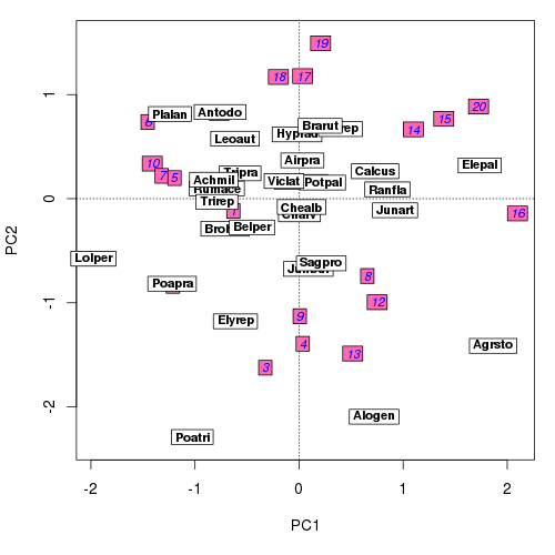
The resulting biplot should look similar to the one below

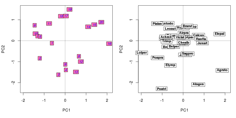
ordilabel()Not perfect, but better than the standard plot() method in vegan. Alternatively, one might wish to draw side by side biplots of the sample and species scores. This can be done simply with a call to layout() to split the current plot device into two plot regions, which we fill using very similar plotting commands as described above
layout(matrix(1:2, ncol = 2))
plot(ord, type = "n", scaling = scl)
ordilabel(ord, display = "sites", font = 3, fill = "hotpink",
          col = "blue", priority = priSite, scaling = scl)
plot(ord, type = "n", scaling = scl)
ordilabel(ord, display = "species", font = 2, priority = priSpp,
          scaling = scl)
layout(1)
ordilabel()You may notice some warnings about scaling not being a graphical parameter. These are harmful and arise because we pass scaling along as part of the ... argument which we also pass on to the plotting functions used to build the plot. We’ve tried hard to stop these warnings in vegan using a technique I blogged about a while back, but it looks like we missed a few of these. It will be fixed in a later version of vegan and the warnings will go away. Next time we’ll look at orditorp().
##Notes 1Whatever “important” means… 2Not that I think this is the best way to analyse these data, it is just for show!

